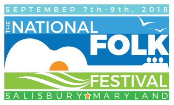
City Reveals Official Logo for National Folk Festival 2018 – 2020

Martin was tasked with creating a striking, easily-identifiable logo which incorporated the City’s brand. The piece needed to be scalable, and its components able to be shifted and changed to suit different treatments.
With the input of the Mayor’s Office and the National Council for the Traditional Arts, Martin created and delivered several designs. The final logo was chosen on Wednesday, September 14, and unofficially introduced at a National Folk Festival sponsor reception held by the Mayor that evening.
Martin said of her design, “I incorporated aspects of the city logo as well as including some of our rural charm and proximity to the ocean. I hoped to design a logo that would not only be reflective of the area, but also serve as a nostalgic symbol for the many fun memories those who attend the festival will leave with.”
“The challenge was to create a visual which would look as good on a poster as it does on a hat, a mug, a tee shirt, or on video,” said the Mayor. “And, most importantly, it had to be worthy of the National Folk Festival’s distinctive history. The logo which Kacey delivered incorporates the Salisbury brand perfectly by marrying the sunrise over the Wicomico with the acoustic guitar – invoking both the folk arts, and the beauty of our city and region. It is a design which Salisbury can proudly say identifies our time as the home of the National Folk Festival.”


